Popups have been with us for quite a while, and they’re here to stay. There’s simply no better way to grab a visitor’s attention than with a compelling website popup campaign.
When you use popups strategically, you can actually vastly improve the customer experience on your website, rather than hurting it. They are a powerful tool for ecommerce store owners looking to increase conversions and drive more leads.
In this blog post, we’ll dive into how website pop-ups work and take a look at 18 famous websites that are successfully using pop-ups to engage their visitors.
Let’s get right into it!
What are pop-ups?
Popups are overlays that appear and cover some portion of your website content. They must be closed before a website visitor can continue browsing.
A popup campaign can serve several purposes, including:
- collecting email addresses,
- promoting special offers,
- and gathering feedback.
Different triggers (timed, scroll-in, exit intent, etc.) control when popups appear. By choosing the right popup triggers and creating relevant messages and offers, you can improve the user experience.
However, it’s important to find a balance to avoid irritating users with excessive or irrelevant pop-ups. Each popup’s call-to-action should guide users to the next stage of the sales process by encouraging engagement and incentivizing conversions.
Why should you use a pop-up on your website?
As we’ve seen, website popups allow you to grab users’ attention so that they really consider the offer you’re making. That’s why they’re such an effective tool for increasing conversion rates.
You should think of pop-ups as a way to enhance your website’s functionality and improve your chances of converting visitors into loyal customers.
Here are the five major benefits of integrating pop-ups into your website:
A second chance to convert: Consider pop-ups as a strategic “backup” for your primary message. If a user doesn’t respond to your website’s main content or call-to-action, a well-designed popup provides a second opportunity to communicate a new offer that may better resonate with your audience.
Decreasing distraction: When used effectively, pop-ups can help users focus solely on essential information. Many websites bombard visitors with numerous options, multiple CTAs, videos, and even chatboxes. By employing a popup, you cut through the noise and deliver a single, focused message.
Efficient list-building: Pop-ups excel as a tool for building email and SMS marketing lists. While the average rate at which visitors willingly share their contact details on a website is 1.95%, employing popups for list-building can significantly elevate this conversion rate to up to 7.65%.
Flexibility in goals: Beyond list-building, pop-ups can serve as tools for collecting feedback, providing personalized product recommendations, or functioning as shopping assistants in your online store.
High ROI: Despite being a cost-effective solution, well-crafted pop-up campaigns have the potential to drive substantial revenue growth. Numerous free and paid popup tools are available, offering a significant ROI compared to the expenses associated with generating additional traffic through advertising.
Boosting your website with popups can significantly enhance user engagement, streamline communication, and contribute to a substantial boost in conversion rates.
18 famous websites using popups with examples
Whether you want to generate leads or convert more visitors into paying customers, you can use a website popup to accomplish these goals more effectively.
Let’s take a look at some great popup examples from leading ecommerce brands. Hopefully, you can find some inspiration on this list.
1. Alo Yoga
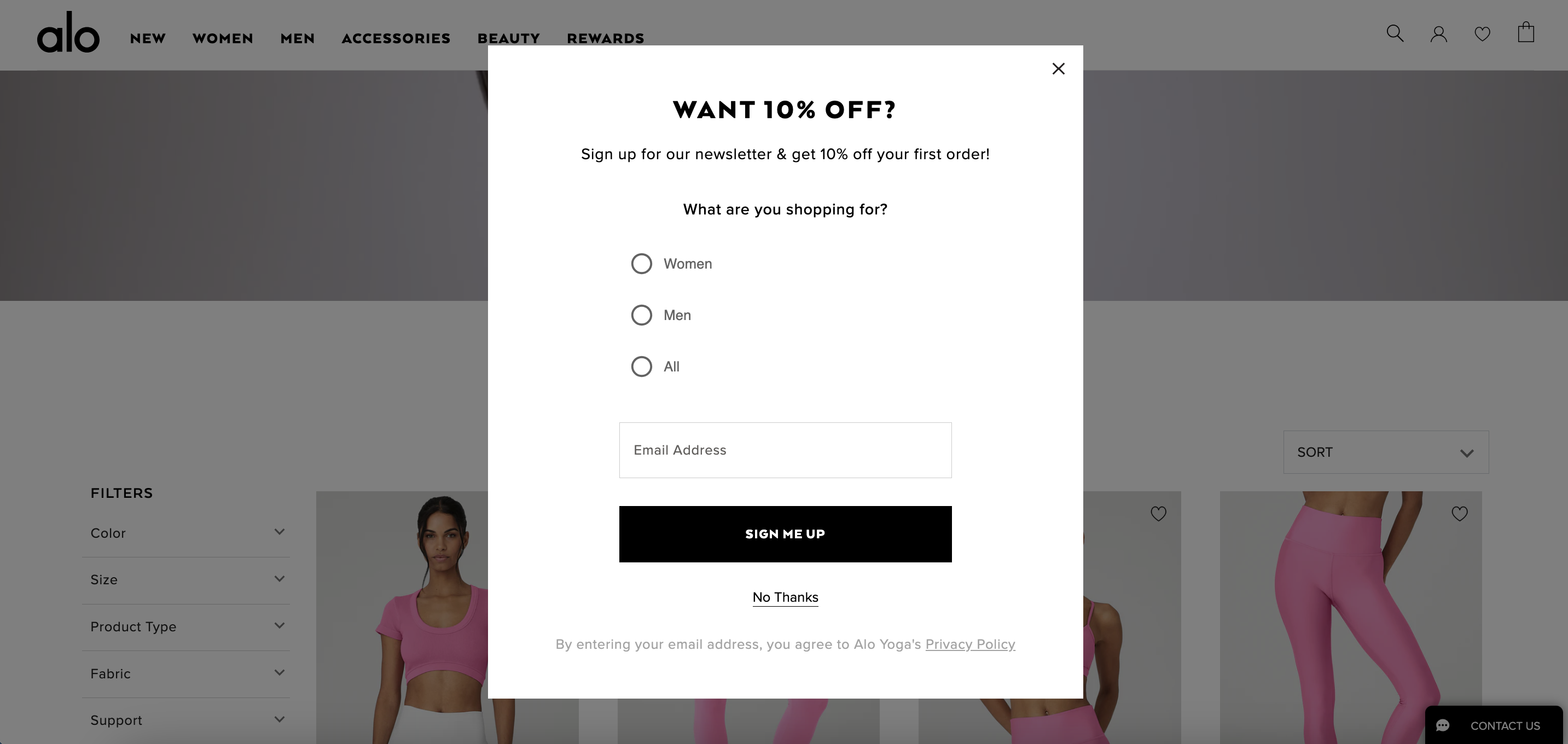
This simple popup example from Alo Yoga aims to gather email addresses when visitors land on their website. Whenever a visitor completes an email opt-in form, Alo Yoga has gained a new lead that they can nurture in the future.
Lead magnet popups work best when you have an eye-catching incentive to convince visitors to sign up, which this 10% discount certainly does well.
2. Beis Travel
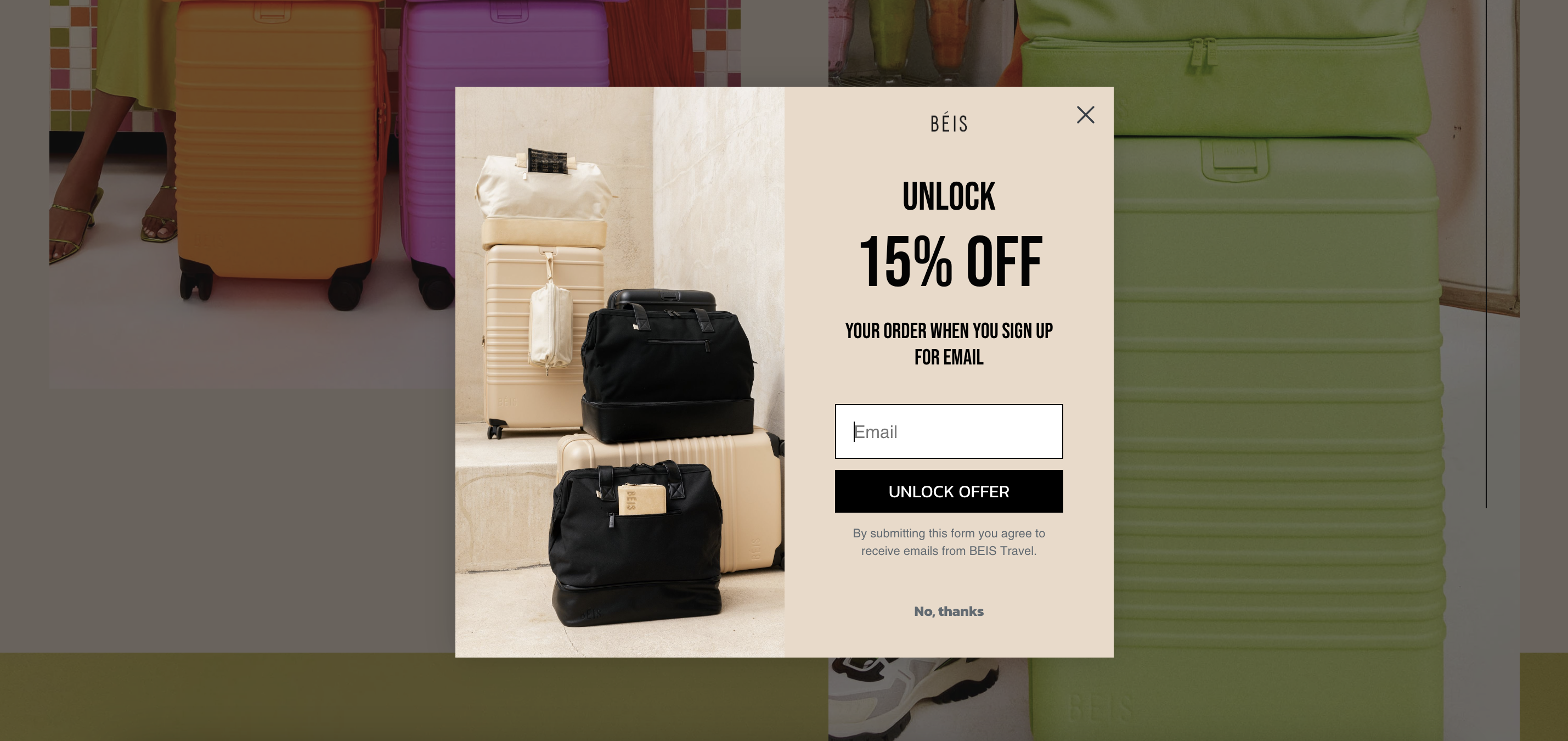
When you’re generating leads with a website popup, you want to make sure you highlight your lead magnet, but you should also show off your products and brand voice. That’s exactly what Beis Travel does in this great example with a simple copy and nice product photography.
Lightbox popups like this one provide attractive visual contrast from the base layer of your website, helping ensure that visitors will pay attention to the offer.
3. Bubble Skincare
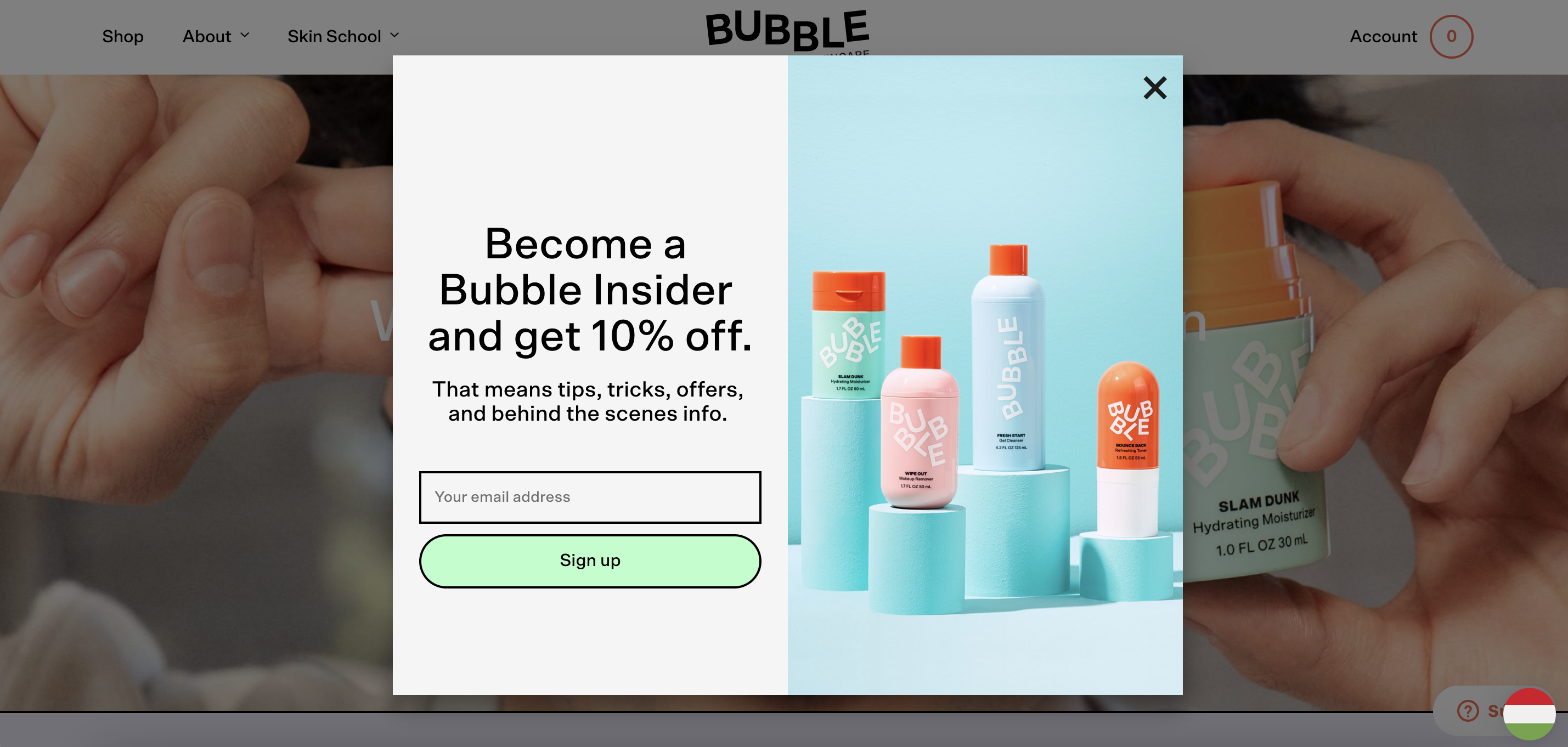
This popup campaign from Bubble Skincare invites their website visitors to “Become a Bubble Insider,” which puts a slightly different flavor on their offer. Instead of only relying on a discount to convince visitors to become email subscribers, the company presents their email list as an exclusive club that you can get into.
Exclusivity is a very strong motivator in ecommerce, so consider using it in your website popups.
4. Caraway
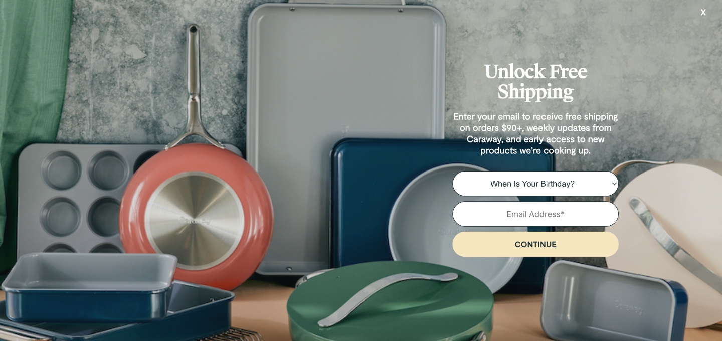
Caraway uses a fullscreen popup to promote their free shipping offer instead of using a smaller lightbox popup. This helps encourage all users to engage with their offer fully instead of being distracted by other elements on the web page.
This approach works because Caraway has a really high-value offer. Free shipping is one of the most persuasive incentives that exist in online shopping, so you should be sure to promote it heavily if you offer it.
5. ClickUp
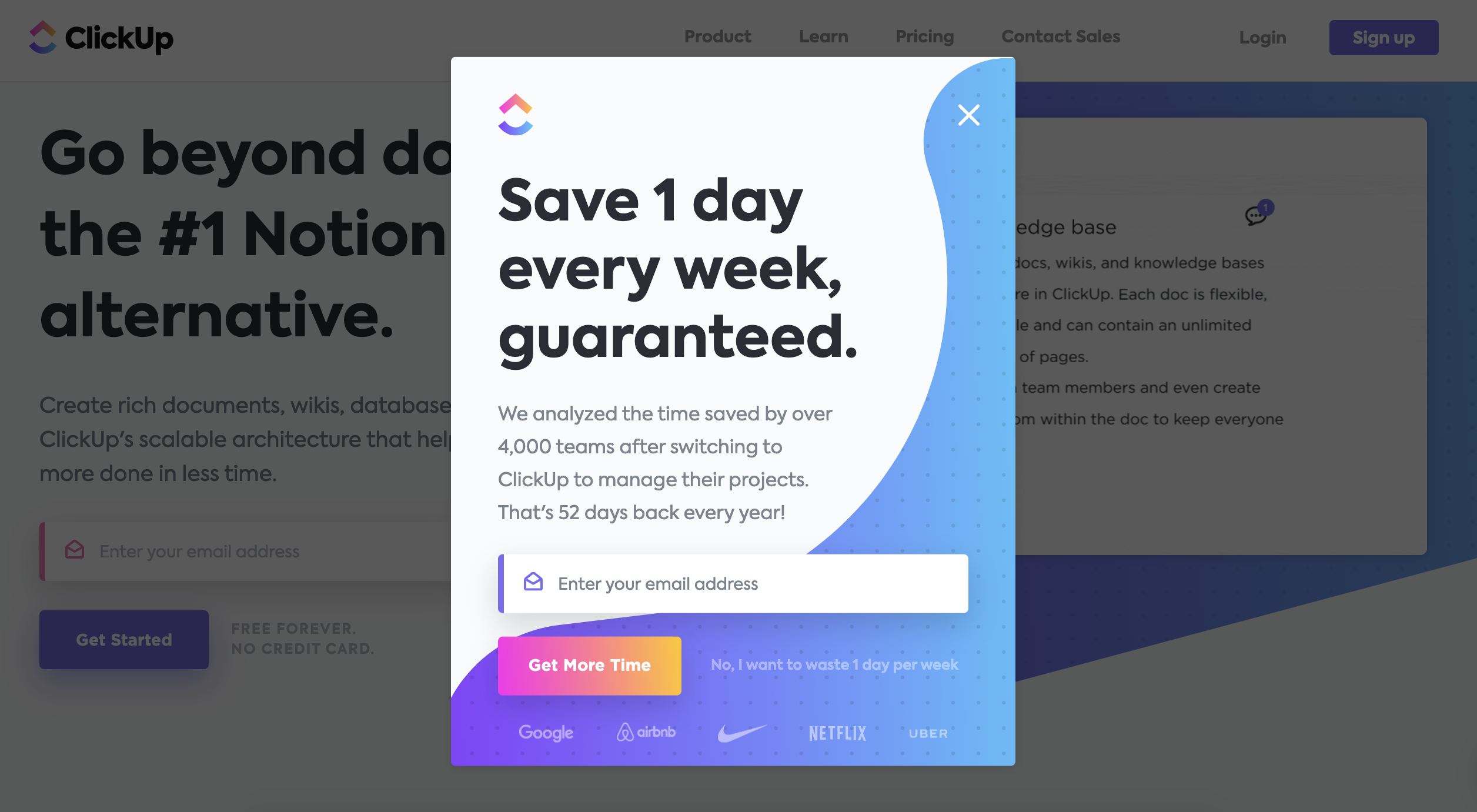
Instead of leading with a discount, Clickup promotes the value that their product brings to the table. Defining your unique selling proposition is a great way to use a website popup.
When you’re trying to generate app downloads as a SaaS business, you really need to explain how users can benefit from using your software.
6. CoSchedule
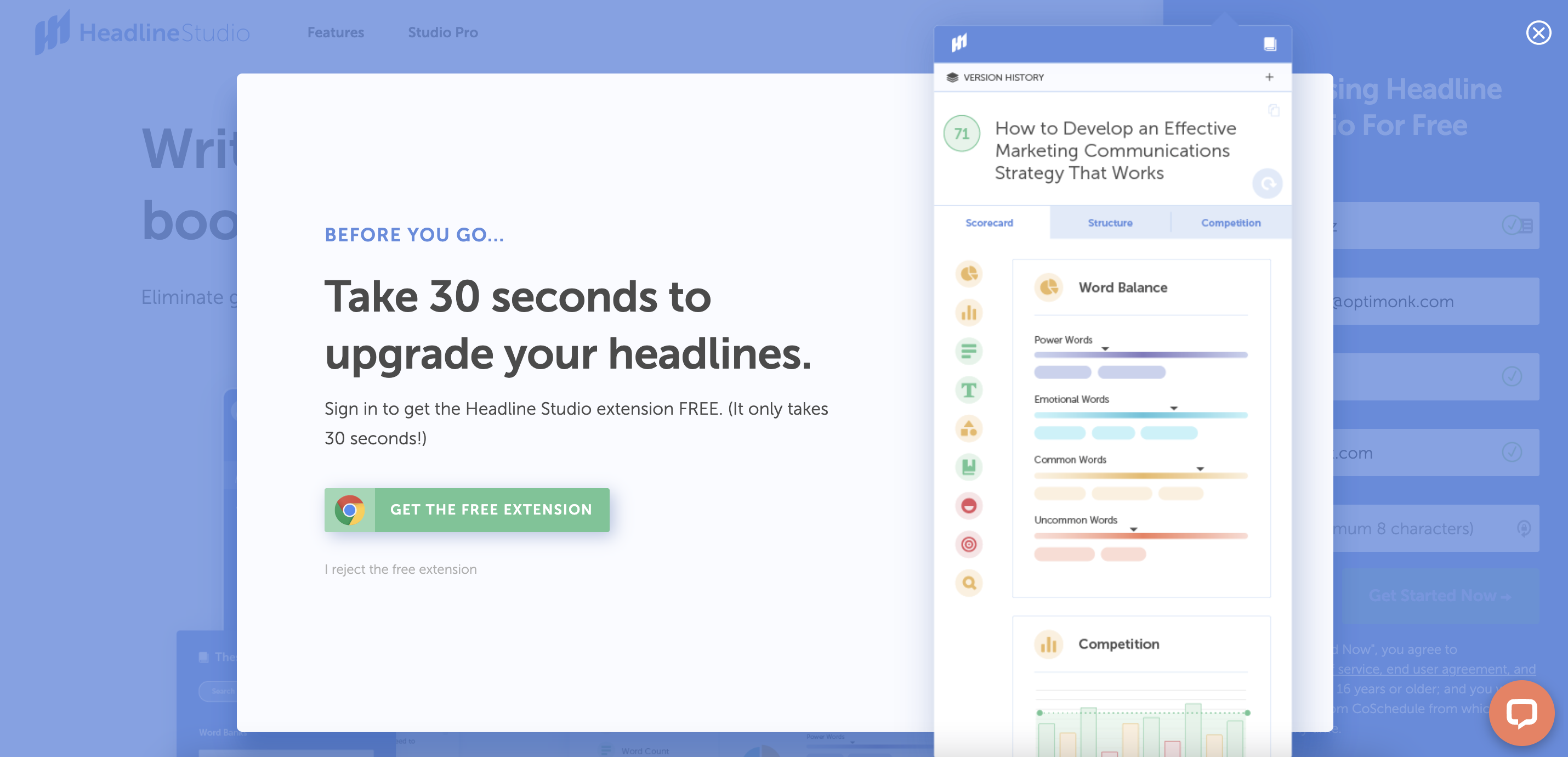
Like ClickUp, CoSchedule highlights the time saving features of their software. Their goal with this exit-intent popup is to get users to try out their free demo, which is conveniently packaged as a Chrome extension.
The large screenshot of their app in use helps potential users get an idea of what’s in store for them if they download the app.
7. Crocs
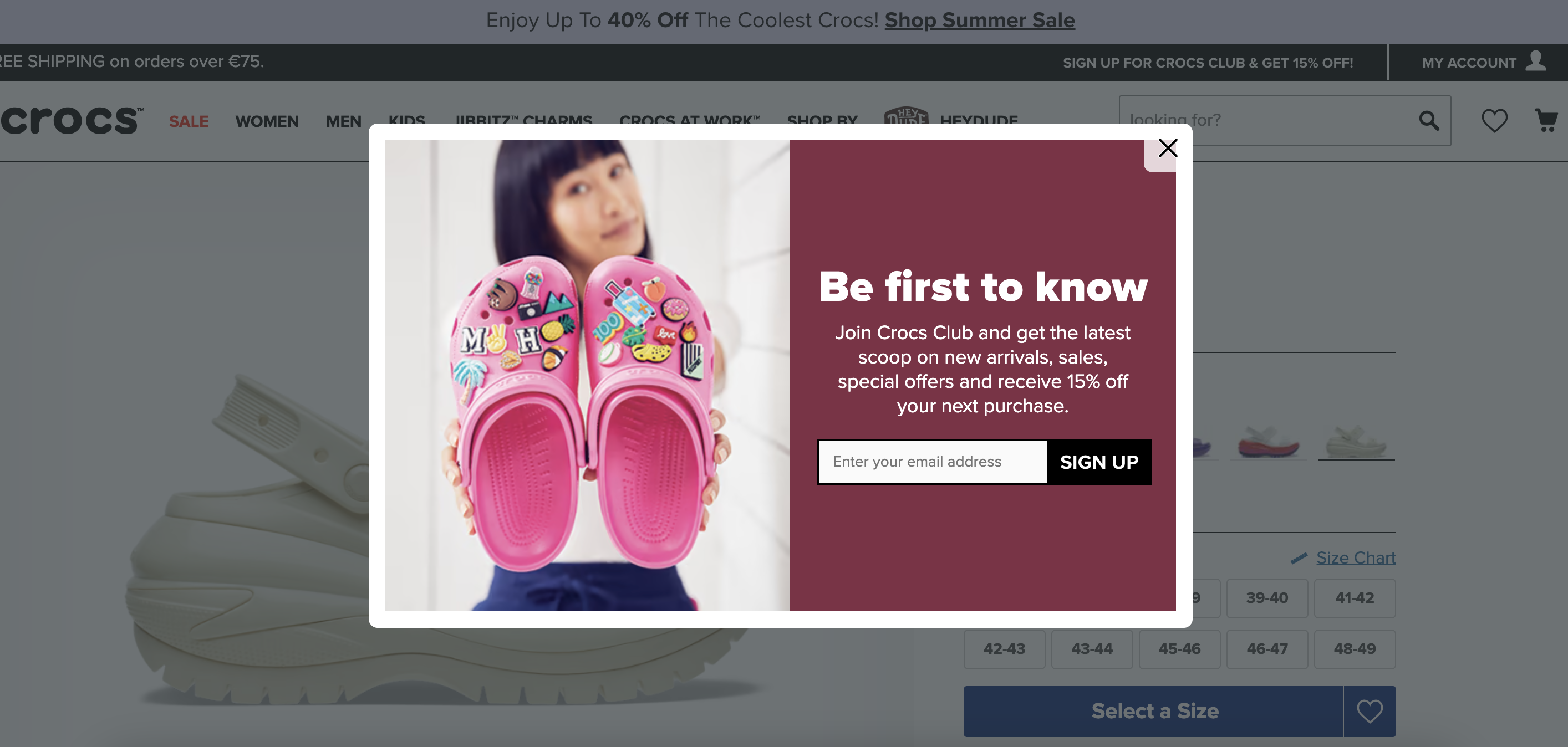
In this lead magnet popup, Crocs pitches their email list as the best way to stay up to date on all the brand’s activity. Notice that they still offer a 15% discount, but it’s not in the headline.
By focusing on the benefit of gaining access to updates first rather than a monetary discount, Crocs is trying to build a base of email subscribers who are truly enthusiastic about their brand.
8. Fiverr
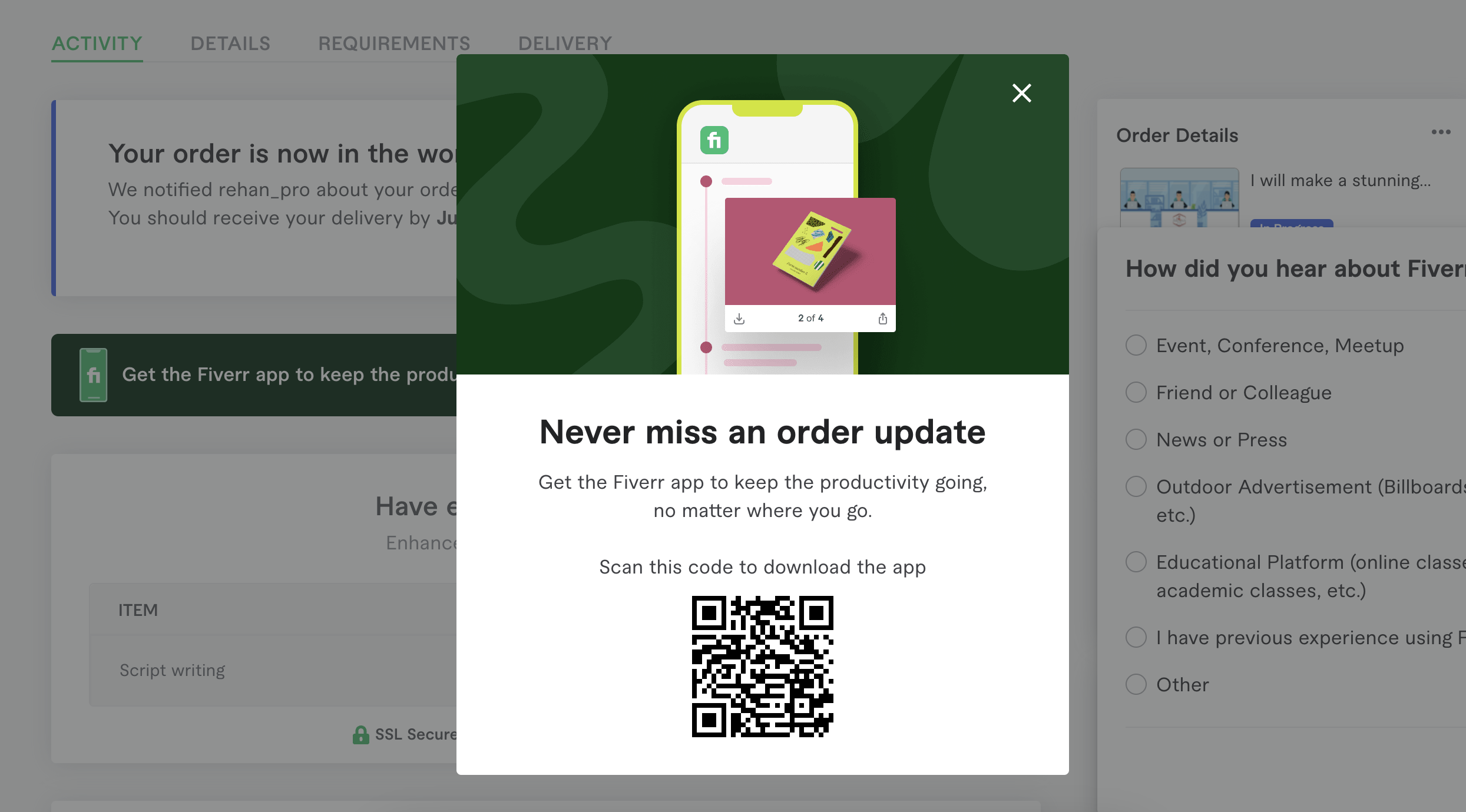
This website popup from Fiverr appears just after a user subscribes to their software, encouraging new users to also download their app. Including a QR code in the popup makes it easy to download the app on your phone, which will likely increase their conversion rate for the campaign.
If you use a post-conversion notification like this one, make sure that you make it exceptionally easy for your new customers to take the next step.
9. Glossier
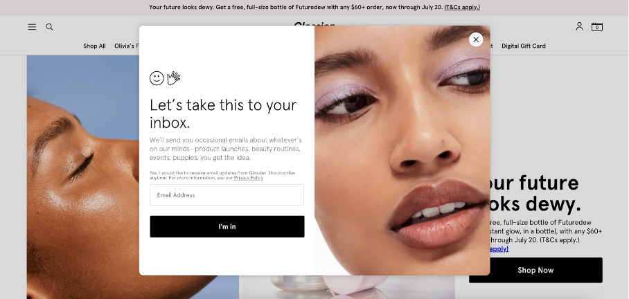
Glossier‘s pop-up is a great example for using humorous and slightly suggestive copy to encourage users to join your email list.
Note that this works for them because they cultivate a personal, intimate relationship with their customers. This approach wouldn’t work for other brands that use a more professional tone.
10. Hootsuite
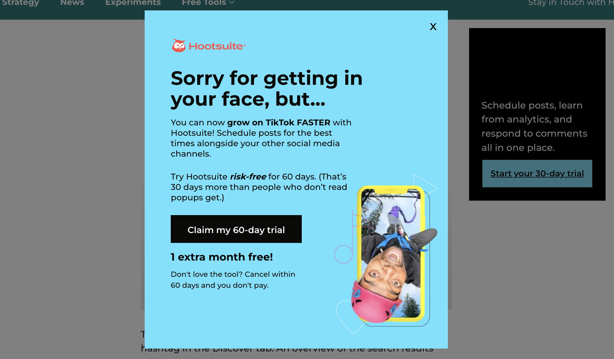
Hootsuite’s pop-up offers website visitors a 60-day free trial of their software. It’s an especially compelling offer because, as they write, you get “1 extra month free!”
Whenever there’s an offer that visitors feel they can only access by saying yes to a popup’s CTA, there’s going to be a high conversion rate. After all, a sense of urgency is a great motivator for people to act now rather than later.
11. Kylie Cosmetics
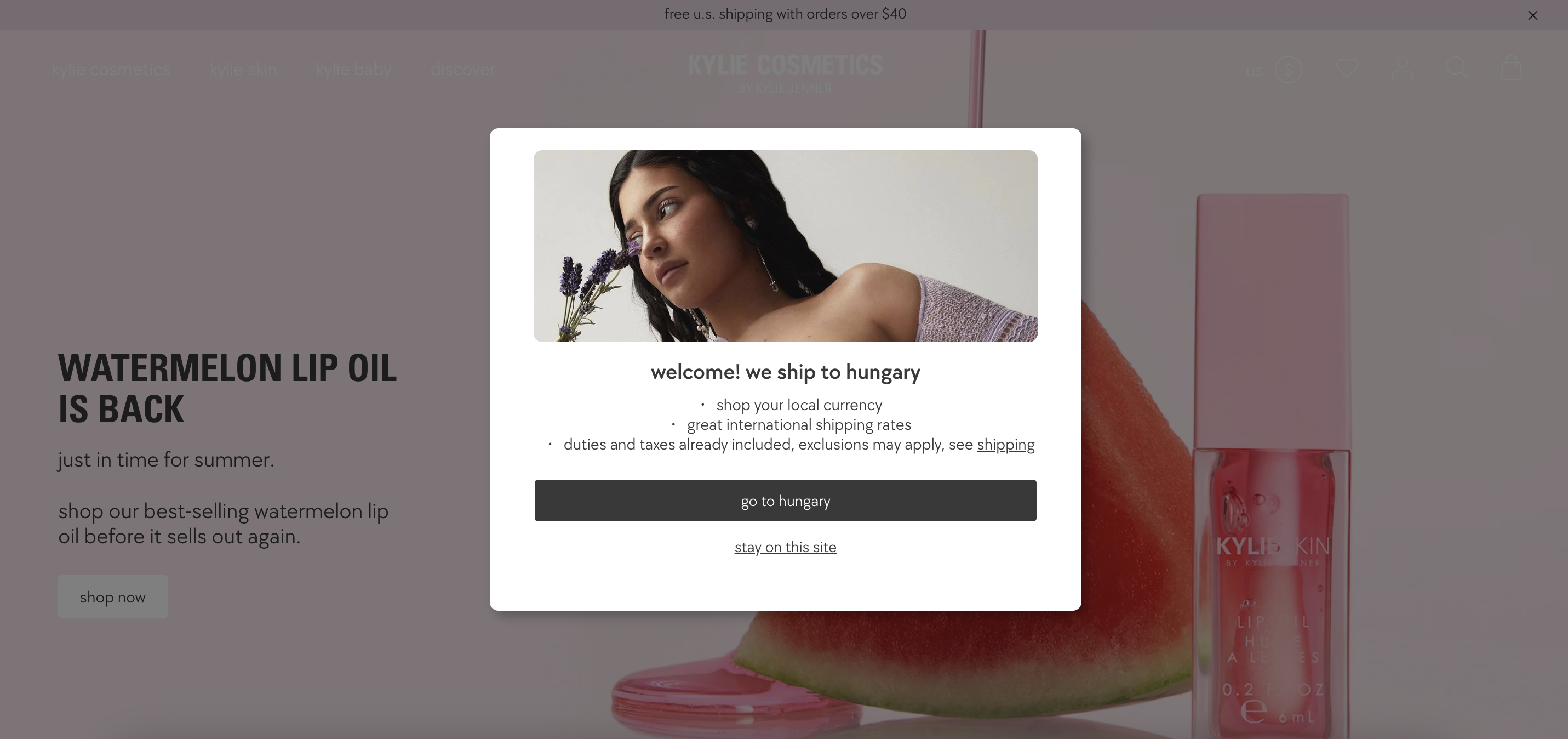
Kylie Cosmetics used location-based personalization to inform visitors from different countries about their shipping policies. In this pop-up example, the brand informs users from Hungary that the brand does ship there.
This is an incredibly useful pop-up because a Hungarian website visitor might not be sure whether they’re able to order from Kylie Cosmetics, and the campaign saves them the trouble of having to look for the information themselves.
12. Pandora
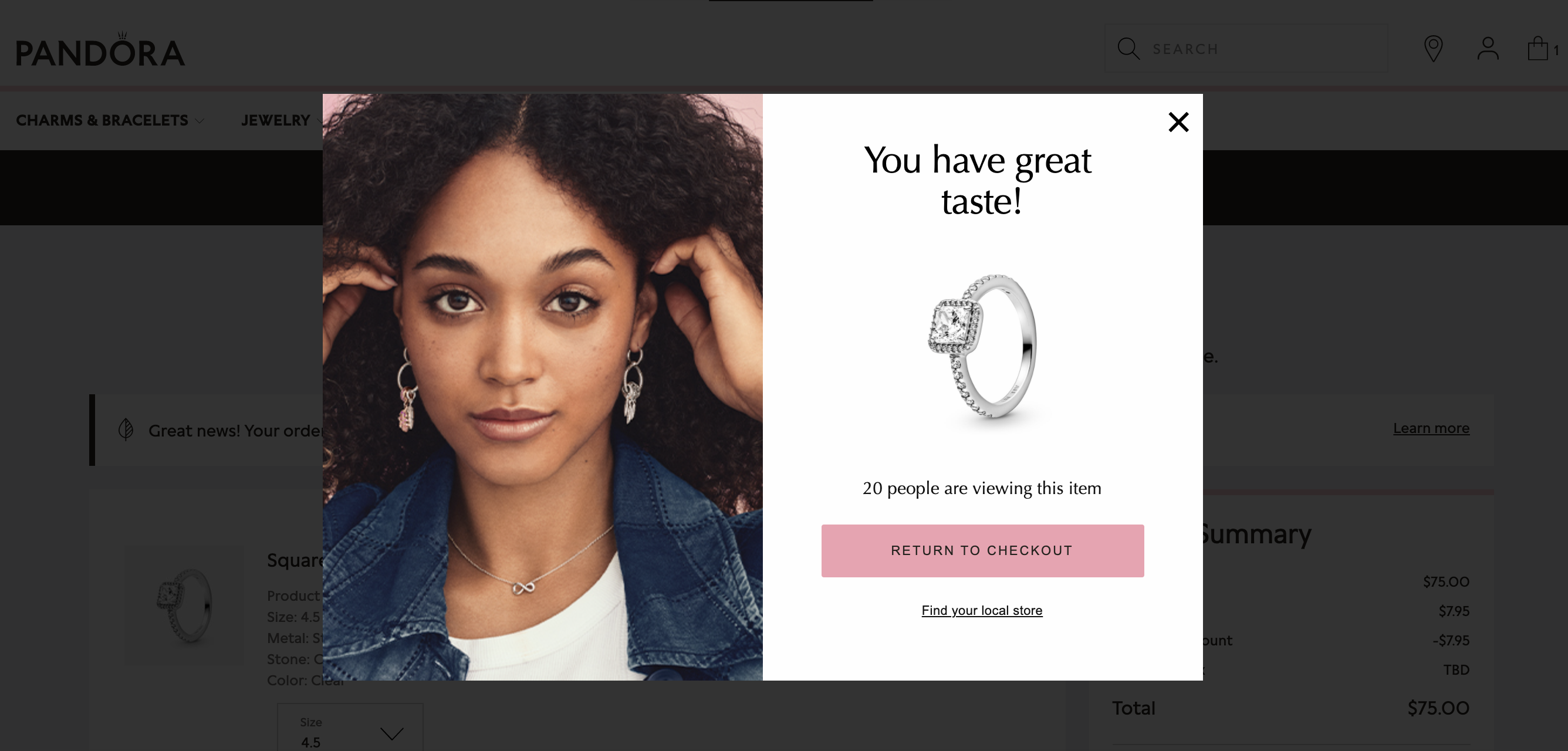
Pandora does two different things with this cart abandonment popup. First, they compliment the user for their taste based on the products they’ve picked out. This is a nice touch that lots of customers will appreciate.
Second, they create a sense of scarcity by telling the visitor how many other people are currently viewing the item that’s in their cart. This provides a subtle reminder that they might not end up getting the product they’re interested in if they don’t act fast.
13. Sephora
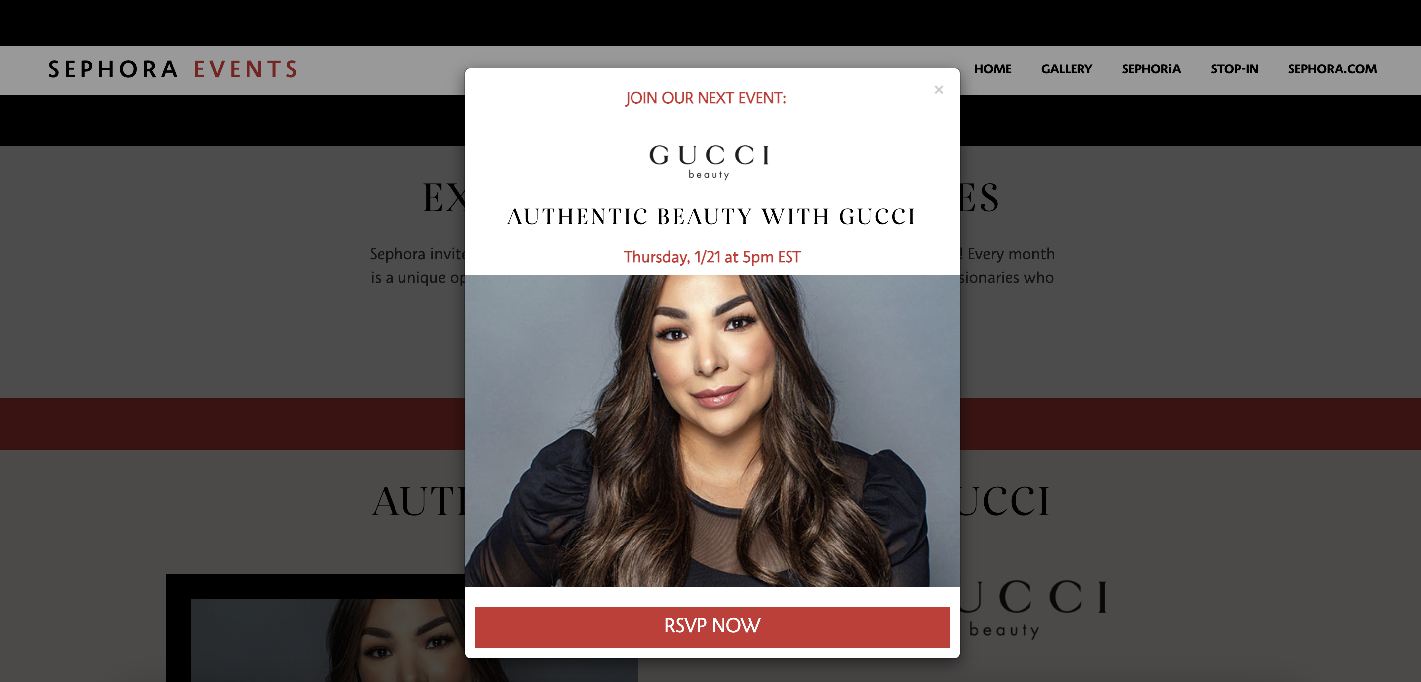
In this timed pop-up, Sephora is promoting a live event with a representative from Gucci. If someone is excited about the event and decides to RSVP, Sephora will have gained a new lead and gathered valuable information about them.
14. Skims
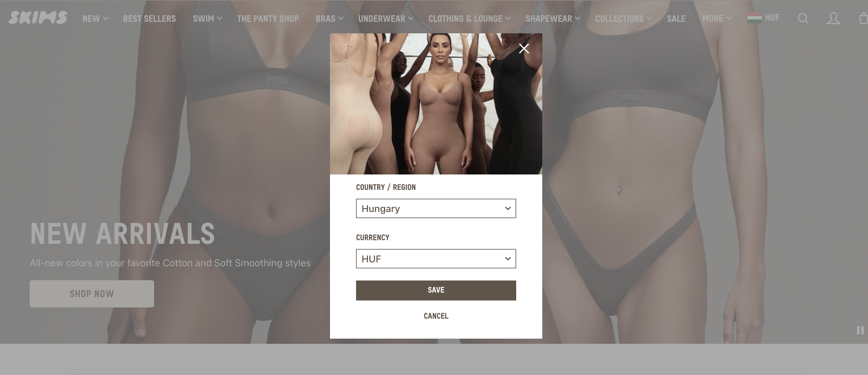
Skims’ homepage pop-up makes it easy for their international visitors to select their location and currency preferences. This small step can make a big difference to the user experience. You should definitely consider doing something similar if your site receives a lot of traffic from around the world.
15. Snow
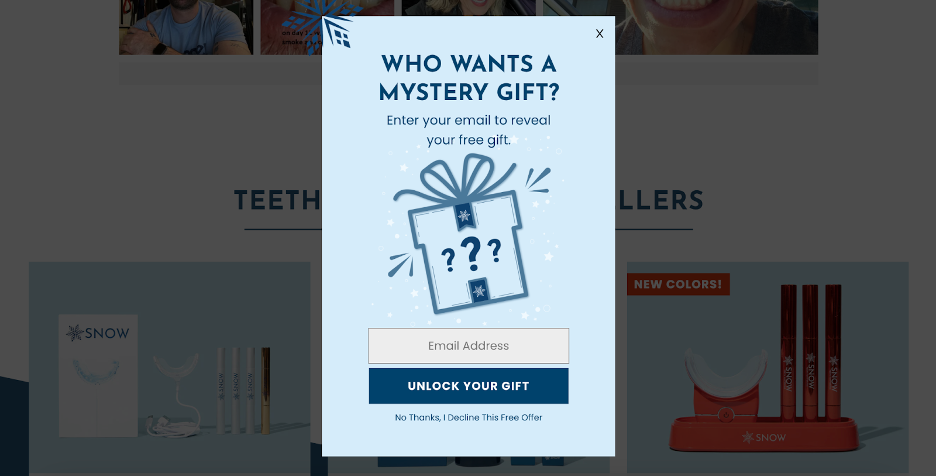
Sometimes, website visitors will be more likely to respond to an offer that has a sense of mystery instead of one that promises a specific monetary discount.
When people see a mystery gift campaign like Snow’s, they’re naturally curious to find out how much it’s going to be, and they’ll be willing to sign up for an email list to find out.
16. The Farmer’s Dog
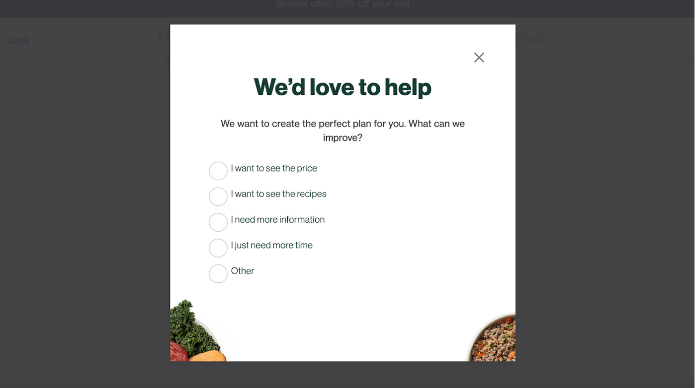
The Farmer’s Dog uses a quiz popup form designed to collect feedback on why abandoning visitors haven’t made a purchase. This can be extremely valuable information, helping you optimize your site for conversions and address common objections or complaints.
17. Urban Outfitters
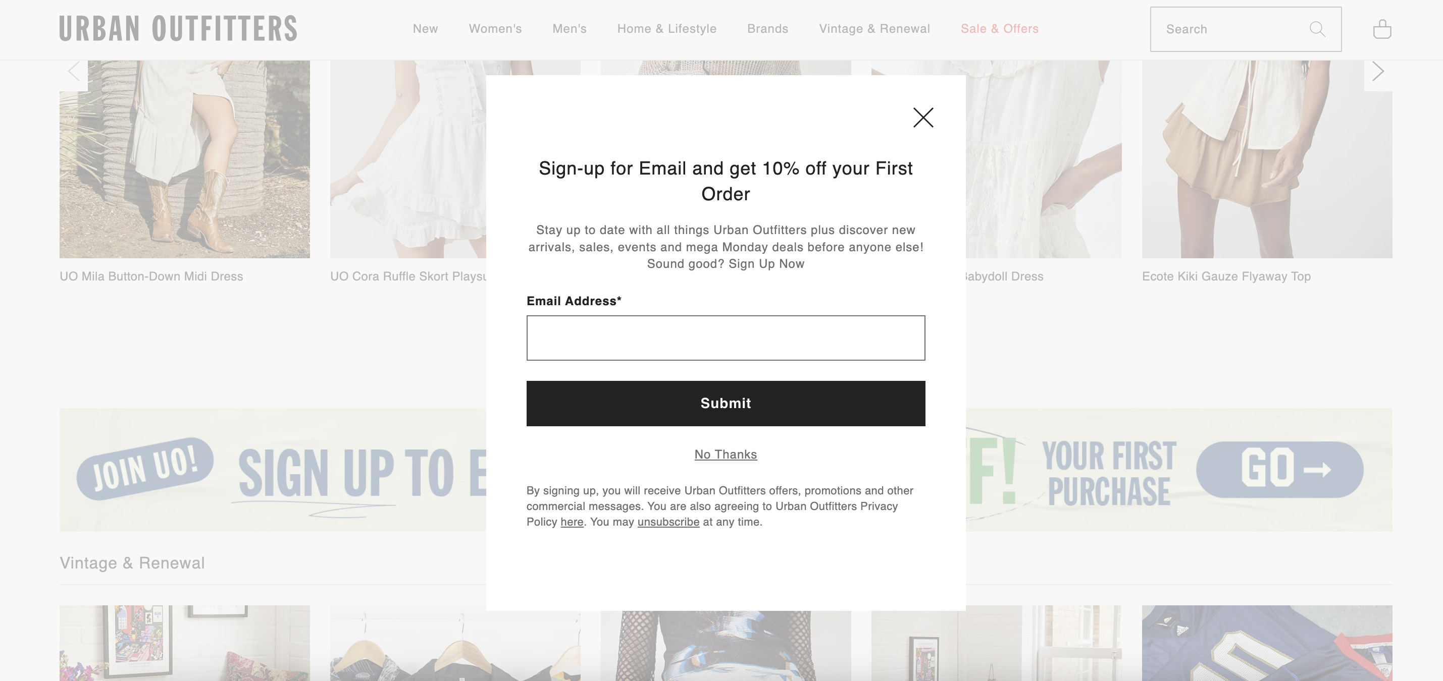
This lead generation pop-up from Urban Outfitters is noteworthy for how well it blends into the rest of their website. With the easy to see “No Thanks” option, it barely feels like they’re interrupting their customers’ browsing experience at all.
18. Victoria’s Secret
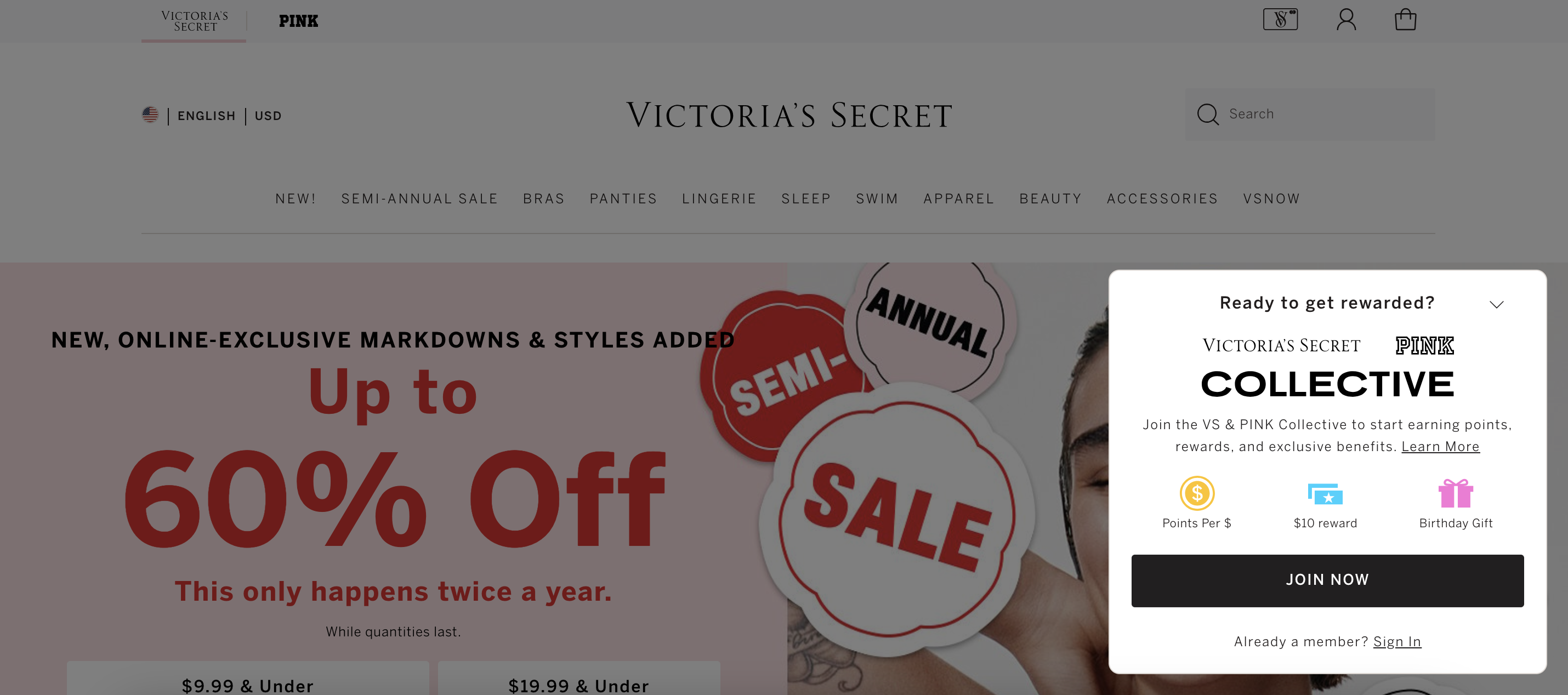
Victoria’s Secret has managed to sustain a loyal base of customers over a period of many years in no small part thanks to their loyalty rewards program. This small website popup promotes the benefits that someone can gain from joining the “Collective.”
Best practices for using popups on your website
Whenever you create a new pop-up, you should keep a few best practices in mind in order to make the most of them.
Whether you’re creating cart abandonment popups, giveaway popups, or lead magnet popups, here are four tips for ensuring that they have the impact you’re looking for.
1. Limit the number of popups on your site
Making sure that you don’t go overboard with website popups is a crucial part of any on-site marketing strategy. If you’re constantly bombarding your visitors with popups from your landing page to your product pages, you’ll end up compromising the user experience.
Not only that, but your popup campaigns won’t make the kind of impact you’re aiming for, since everyone will get used to closing them without even absorbing your messages.
2. Find the right timing and placement
Timing is key for creating effective popup boxes. A single pop-up can have a stellar conversion rate or a dismal one depending on when you display it.
A quick rule of thumb for choosing when to display your popups is to think about the action that you’re trying to get people to complete. You should make sure the popup appears when the CTA will be relevant to your users.
For example, if you’re trying to generate more email subscribers using a first-time purchase discount, it makes sense to display your email opt-in popup form early in the customer journey. That way, your website visitors will be aware that they have a percentage discount waiting for them while they shop.
3. A/B test different popup designs and messages
A/B testing all your campaigns is another crucial pop-up best practice. You can try out completely different popup templates or see whether variations on the same pop-up lead to better results.
It’s also a good idea to test different popup types against one another, such as trying both lightbox popups and fullscreen popups for one of your campaigns.
Finally, you can consider A/B testing different design elements such as color schemes, fonts, images, and wording.
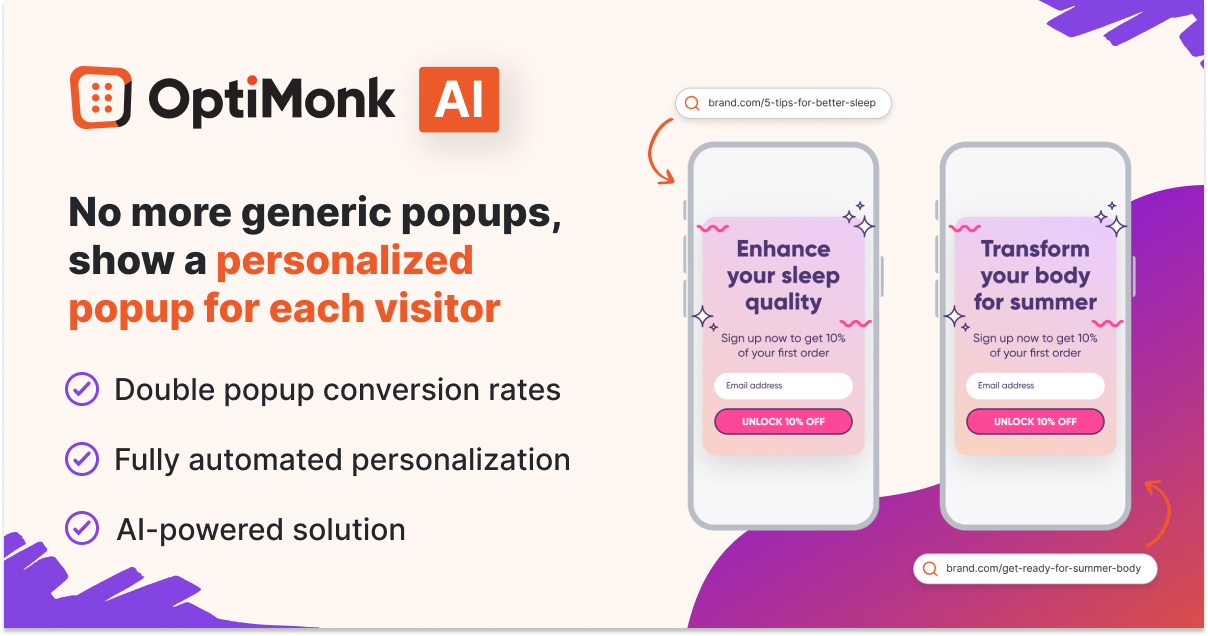
4. Personalize your popup content based on interest and user behavior
Personalized messaging helps build a strong connection with users by increasing the relevancy of the messages you’re sending out. Using data like the pages they are browsing can help you customize the messaging of your popups and increase the chance of conversions.
Using OptiMonk’s AI-powered Smart Popups tool, you can easily tailor the messaging of your popups to each visitor’s interest automatically—without any manual work—and double your popup conversion rates.
FAQ
What is an exit intent pop-up?
Exit intent pop-ups are campaigns that appear when a user is just about to close a webpage. On a desktop computer, exit intent is detected by tracking a user’s cursor. When they move quickly to the top right corner of the screen (i.e. where the exit button is), an exit intent pop-up is triggered. On mobile devices, exit intent triggers include scrolling up quickly and tapping near the top right corner of a web page.
How to prevent popups from annoying users?
To avoid annoying website visitors with popups, ensure they are used sparingly and only when appropriate. Also, you should never use multiple website popups on the same page. Make sure the popup is relevant to the content on the page and offers value to individual users. You should also make sure that users can easily close the website popup to prevent frustration. You can use a timed popup to give users enough time to explore your website before being presented with an offer or call-to-action. Whatever type of website popups you use, you should always make sure that each popup features a helpful message that brings real value to your users. Finally, you can always consider using an exit-intent popup that appears when a user intends to leave so that you aren’t interrupting their browsing experience.
How to measure the effectiveness of your popups?
Tracking relevant metrics is crucial when it comes to measuring the effectiveness of website popups. There are several KPIs (key performance indicators) that you should monitor, including click-through rates, conversion rates, and bounce rates. Many website popup tools will have an analytics page that collects all the relevant data on your marketing performance in one place.
Wrapping up
Now that you’ve seen our list of 18 great popup examples, hopefully you’ve found something useful for your own website. The popularity of popups among top ecommerce brands is no coincidence—they deliver results.
As a small or medium-sized ecommerce business, popups offer a cost-effective, reliable method of boosting conversion rates and revenue. Strategically displaying popups on blog pages or product browsing sessions can guide visitors towards making a purchase, thereby maximizing the potential of your existing website traffic.
To easily implement any of the popup strategies we’ve discussed, OptiMonk provides popup templates that can get you up and running in no time. Plus, OptiMonk is a free tool, so there’s no reason to hesitate—sign up today!
Share this
Written by