- Blog
- 10 Popup Mistakes That Are Killing Your Conversions (And How to Fix Them)
10 Popup Mistakes That Are Killing Your Conversions (And How to Fix Them)
-
Barbara Bartucz
- Conversion
- 6 min read
Table of Contents
Does your popup struggle to convert visitors?
If your popups are getting ignored—or worse, annoying your audience—you might be making some critical mistakes.
The good news? These mistakes are easy to fix once you know what to look for.
In this article, we’ll reveal the 10 most frequent mistakes that can sabotage your conversions, and provide solutions for fixing them.
Let’s dive in!
10 common pop-up mistakes
Ready to learn? Let’s check out the biggest popup mistakes—and how to fix them fast!
1. Not having a popup at all
Some businesses avoid popups altogether because they’re afraid of annoying their visitors, and we have to admit that popups have a bad rap.
But the truth is that popups only become annoying when they’re poorly executed.
When used correctly, they can significantly boost engagement and sales.
Popups are especially useful for growing your email list, announcing promotions, and collecting customer feedback.
How can you fix it?
If you’re not using them, you’re missing out on valuable opportunities.
OptiMonk makes it easy by offering 40+ use cases and 300+ customizable templates to help you get started.
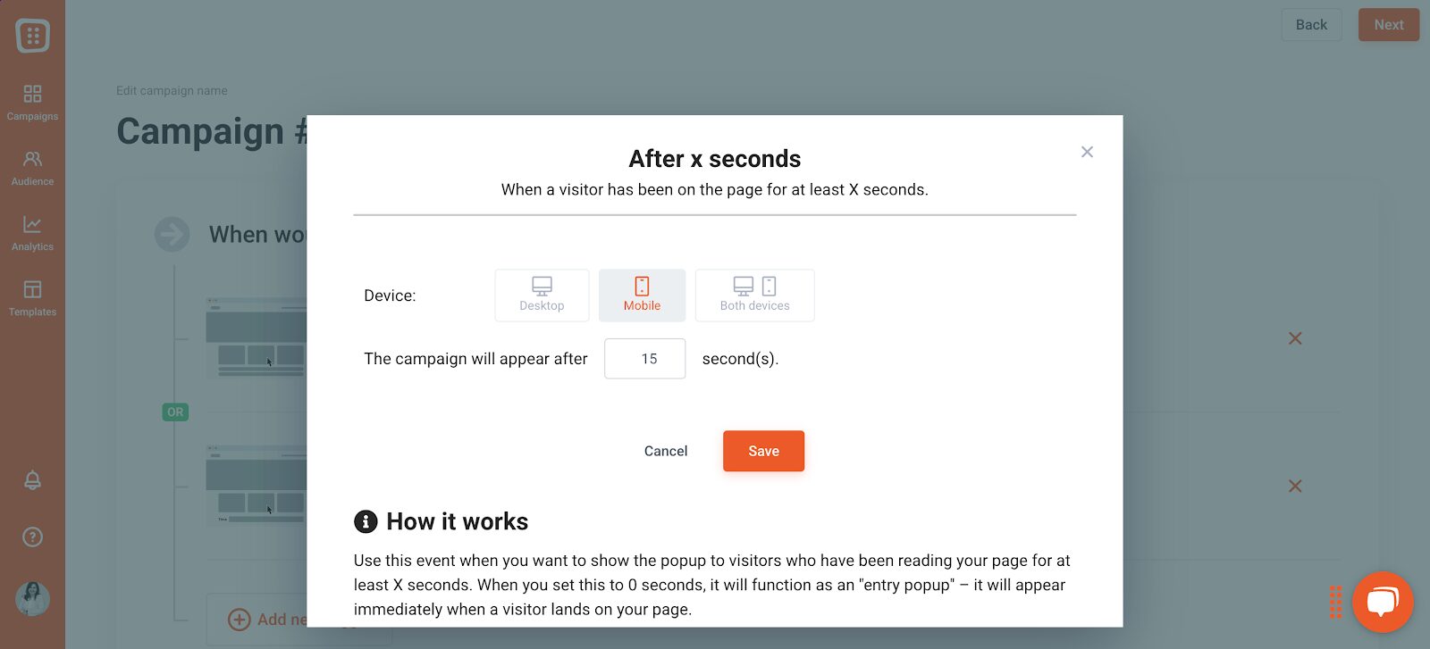
2. Your popup appears at a bad time
Popup timing is crucial when it comes to conversions. If the popup appears too soon, visitors might dismiss it. But if the popup is displayed too late, your potential customer might have already left.
How can you fix it?
To address this, you have to make sure your popup appears at the optimal moment.
With OptiMonk, you can set popups to trigger when a visitor is about to exit (exit-intent), after they scroll a certain percentage of the web page, when they click on a specific element, or following a period of inactivity.
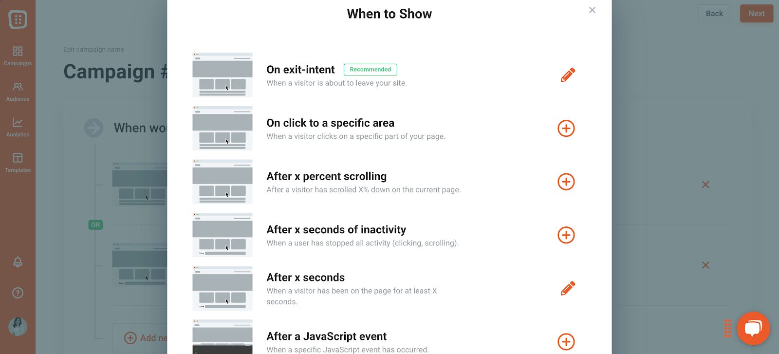
You can even set different triggers for desktop and mobile users, ensuring a seamless experience across all devices.
Regarding the timing of popups, this obviously depends on your goals and who you want to target.
Generally, the best solution is to use exit-intent, supplemented by a teaser. In addition to seeing your popup when they’re leaving, visitors will also see the offer—in a non-intrusive way in the corner—the whole time they’re on your site. This means people who want to can take advantage of it at any moment.

Of course, there are cases where exit-intent is not the best solution. For example, if you want to welcome returning visitors, different timing will likely be more effective.
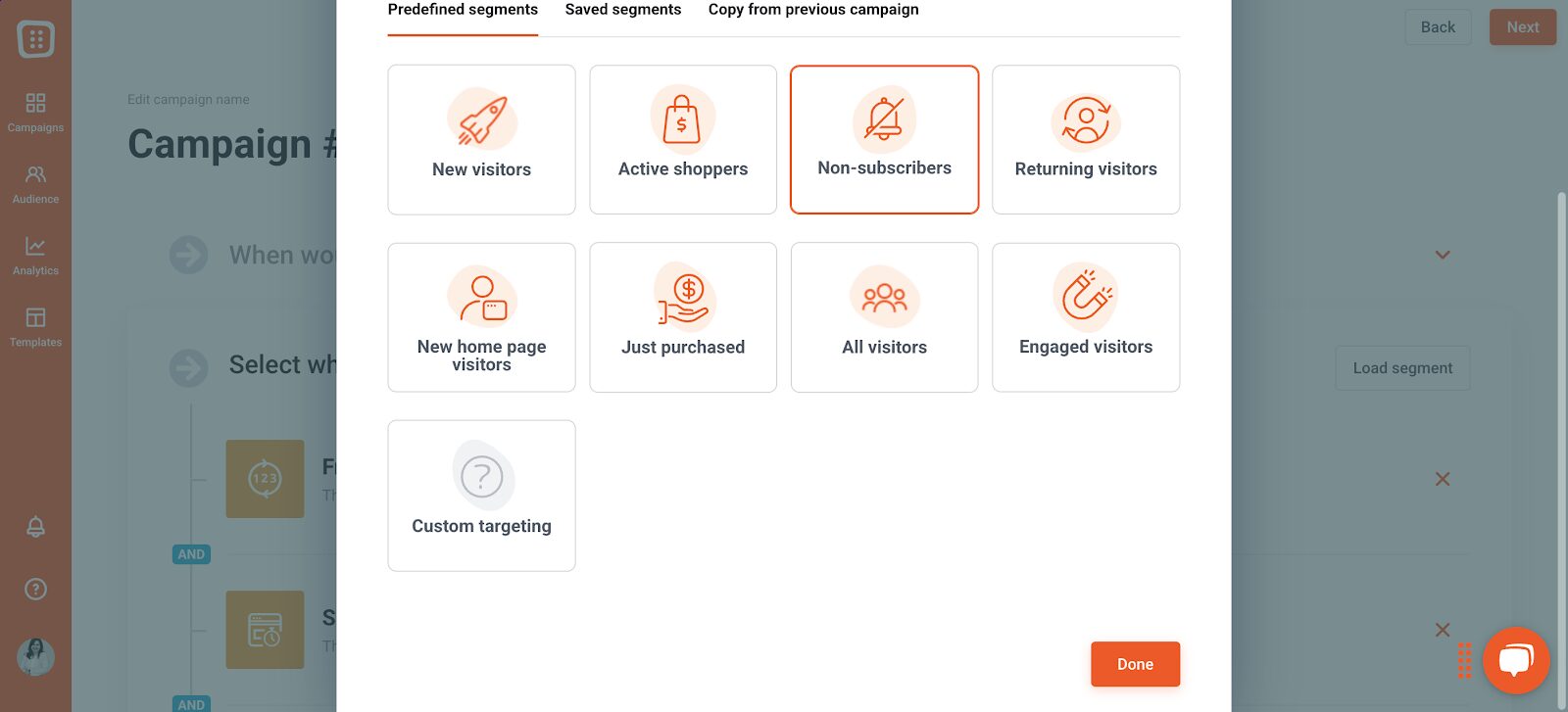
3. Not segmenting your website visitors
Are you targeting EVERYONE?
If you’re showing the same popup and the same message to every visitor, you’re making a big mistake.
A returning customer doesn’t need to see a newsletter signup popup again, and a first-time visitor won’t respond to a message that assumes they’ve shopped with you before.
Irrelevant popups lead to frustration and lower conversion rates.
How can you fix it?
To fix this, you need to show the right message to the right people. OptiMonk allows you to segment your audience based on factors like browsing behavior, location, and cart value.
You can even save and reuse audience segments for future campaigns, ensuring that every visitor gets a personalized experience.
4. Too many input fields
Asking visitors for too much information can be a major turnoff. Long forms make the signup process feel like a chore, leading to higher abandonment rates.
How can you fix it?
The best approach is to keep it simple and break the process into smaller steps using a multi-step popup. This prevents the common mistake of overwhelming your audience by asking for too much information upfront.
Take a cue from Aura Pets—they start by requesting just a first name and email on the first screen.
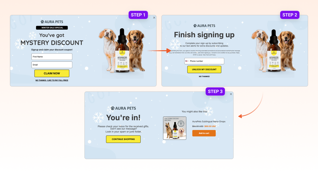
Then, in the next step, they ask for a phone number.
Finally, on the last page, users receive their promised discount. This gradual approach makes it easier for visitors to complete the process, increasing sign-ups without creating friction.
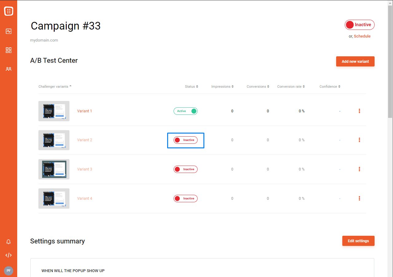
5. Not A/B testing your popups
If you’re not A/B testing your popups, you’re guessing what works instead of finding out for sure.
Without testing, you won’t understand which headlines, designs, or offers perform best, and your conversion rate might suffer as a result.
How can you fix it?
The solution is simple: always test. With OptiMonk, you can easily create two or more versions of a popup and see which one performs better.
Experiment with different images, wording, timing, and offers to find the winning combination that drives the most conversions.
Create at least two variants, activate them, and your A/B test is up and running. Simple as that!
6. Using too many popups
While popups are effective, overwhelming your visitors with too many can backfire. If every action they take triggers popups, they might get frustrated and bail.
How to fix this?
To prevent this, use popups strategically. OptiMonk’s User Experience Protector ensures that visitors aren’t bombarded with too many popups in a single session.
You can customize the settings to limit how many popups users see, keeping the experience smooth and user friendly.
You can access this feature under Settings / User Experience Protector.
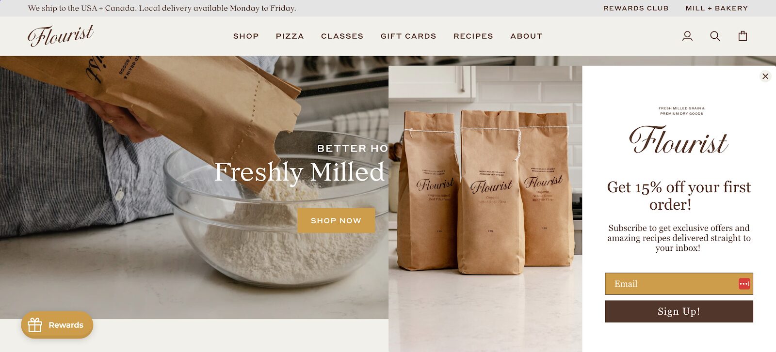
7. Not showing the X button
There’s nothing more frustrating than an intrusive popup that won’t go away. If visitors can’t easily find the close button, they may exit your entire site instead of just the popup.
How to fix it?
To fix this, always ensure the close button is visible and easy to find.
A great example is Flourist, who implements popups with a clearly visible close button.
Giving users an easy way to dismiss the popup keeps the experience positive while still delivering your message.
8. Boring, non-engaging popups
A generic popup with a dull message won’t grab anyone’s attention. Today’s online shoppers expect interactive, engaging experiences.
If your popups don’t stand out, they’ll be ignored.
How to fix it?
To make your popups more exciting, add gamification elements. Instead of a simple email signup form, try using a spin-the-wheel offer, a scratch-to-reveal discount, or an interactive quiz.
These fun, engaging popups encourage interaction and boost conversions. OptiMonk offers a variety of gamification popup templates to help you create an engaging experience that captures attention.
Gamify your popups now with these templates:
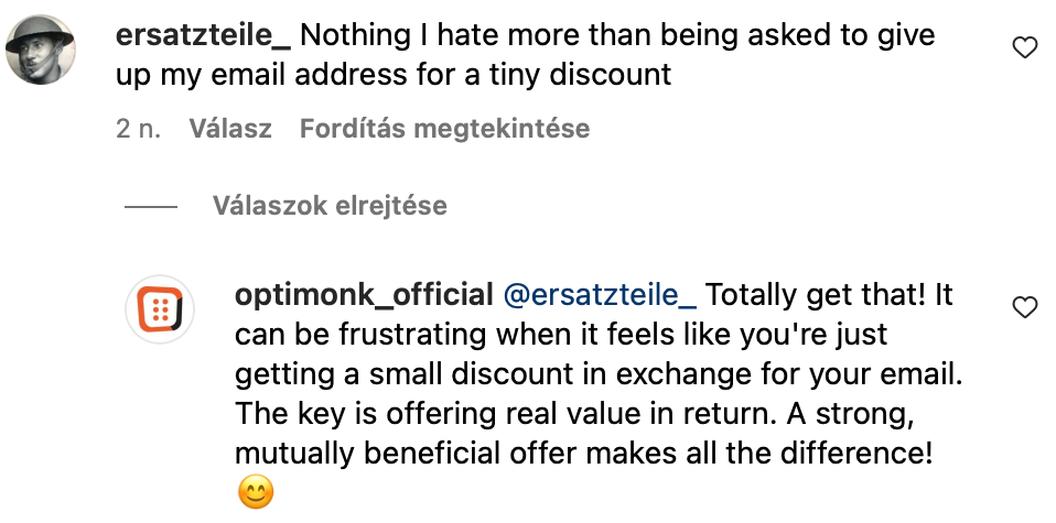
9. You don’t have a strong offer
Visitors are unlikely to give you their email addresses for nothing in return. If your popup doesn’t provide a compelling reason to sign up, people will simply ignore it.
Here’s a recent comment we received on our Instagram account.
The user is right; it’s really annoying when a brand asks for your email address without offering real value in exchange.
How to fix it?
To fix this, make sure your welcome offer is valuable and relevant. Popular incentives include discounts (10-20% off), free shipping, or lead magnets like free ebooks or exclusive content.
The key is to make sure the offer feels like a fair exchange.
Kickstart your campaign with these ready-to-use templates:
10. Your popups are not mobile friendly
With the majority of web traffic coming from mobile devices—close to 60%–it’s crucial that your popups are optimized for smaller screens.
If your popups are difficult to close, slow to load, or don’t display correctly on mobile, you’re losing potential customers.
How to fix it?
The solution is to use mobile-friendly popups that are designed specifically for smaller screens. They should load quickly, be easy to navigate, and have large, tappable buttons.
A great example comes from Quore—they have a sleek, well-designed mobile popup that enhances the user experience rather than disrupting it.

OptiMonk provides a variety of mobile-ready templates so you can create popups that work seamlessly across all devices.
Make your popups stand out on mobile with these templates:
Final thoughts
Popups aren’t the problem—bad popups are. If your popups aren’t performing well, chances are you’re making one of these common mistakes. The good news? They’re easy to fix.
By timing them correctly, segmenting your audience, simplifying your forms, and making them more engaging, you’ll turn popups into a powerful tool that drives conversions instead of driving visitors away.
Ready to create high-converting popups? Get started with OptiMonk for free and take your conversions to the next level!
Migration has never been easier
We made switching a no-brainer with our free, white-glove onboarding service so you can get started in the blink of an eye.

What should you do next?
Thanks for reading till the end. Here are 4 ways we can help you grow your business:
Boost conversions with proven use cases
Explore our Use Case Library, filled with actionable personalization examples and step-by-step guides to unlock your website's full potential. Check out Use Case Library
Create a free OptiMonk account
Create a free OptiMonk account and easily get started with popups and conversion rate optimization. Get OptiMonk free
Get advice from a CRO expert
Schedule a personalized discovery call with one of our experts to explore how OptiMonk can help you grow your business. Book a demo
Join our weekly newsletter
Real CRO insights & marketing tips. No fluff. Straight to your inbox. Subscribe now
Share this article
Written by

Barbara Bartucz
Barbara is a Content Marketer at OptiMonk. She takes pride in creating different forms of content, whether it’s an article, a video, or an e-book.
You may also like
- Posted in
- Conversion
Partner with us
- © OptiMonk. All rights reserved!
- Terms of Use
- Privacy Policy
- Cookie Policy
Product updates: January Release 2025